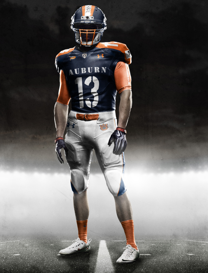
A few weeks ago, I asked Craig Joe of CraigJoe.com to do a Nike Pro Combat version of Auburn’s uniforms. He delivered. With South Carolina announcing that they will be wearing “Wounded Warrior” uniforms against Auburn this weekend, I asked Craig if he could create a mock-up of Auburn’s version. He delivered again.
I love the Army-style stenciled ‘AUBURN’ across the front. The “FREEDOM” down the sleeve and the camo stripe on the helmet are nice touches as well. If Under Armour ever does convince Auburn to do anything like this, I think something along these lines would work.
What do you think? Is it more acceptable because it’s for a good cause?


22 comments
I like it, can’t for the life of me figure out what is on the white part of the helmet?
To me it appears to be a soldier carrying a wounded a soldier.
It’s the Wounded Warrior’s logo. http://9kidfitness.com/wp-content/uploads/2011/05/Wounded-Warrior-Project.bmp
Its the digitized desert camo…
Yes, that is what’s on the stripe, I think he meant the tag or whatever you call it right above the face mask.
no no no
nice like it and for a good cause
enough with the uniform stuff. just last year we all mocked oregon for their multitude of funky uniforms and now this? i don’t like it one bit. call me old school and afraid of change, but i just think it’s all silly. i’m a fan of classic and i hope auburn never opts for something like this. although, with the odd leg stripe change on this season’s uniforms and other schools starting to mess with their classic looks i’m sure it will happen one day. i just won’t be a fan of it. i’m not sure if you’ve all seen the uniform mess at maryland and georgia’s unis vs. boise st were a joke. a lot of good that did them. war eagle.
and can anyone explain the change in leg stripes this year? is that supposed to make them look faster or something? it always looks to me like they screwed up at the factory. war eagle.
Really like this one
That is soo sick. Hope to see them where it some day.
Not just no, but HECK no.
You’re right Jared, they are sick— nauseating.
The only thing I like is the “…Army-style stenciled ‘AUBURN’ across the front.”
The rest can go.
Under Armour used less panels on the pants this year. It’s supposed to be more elastic and therefore easier to move. Since the stripe is sewn in it looks tapered with the panel cutting in. They went from 10 to 6 panels. Believe it or not it’s actually about function.
BTW, this is a miserable design. AU could do a Wounded Warrior uni by having camo numbers and a camo collar on the current uni. It would simple, subtle, and effective.
My eyes! My eyes!
Who are these horrible graphic designers? I’m all for concepts, but at least execute it well.
Then do it.
Bam!
I will, when I get a break from the 8-10 hours of design I do everyday. It would be something similar to what was mentioned above: “AU could do a Wounded Warrior uni by having camo numbers and a camo collar on the current uni. It would simple, subtle, and effective.”
This looks good on a sllek, slim muscalar body. I am afraid it would look more like “wounded battleship” on big gutted lineman!! WAR EAGLE~!!!!
That would be a great uniform for some (or any) other team.
I don’t even like the fact that they changed to font for the names on the back so I certainly don’t like these