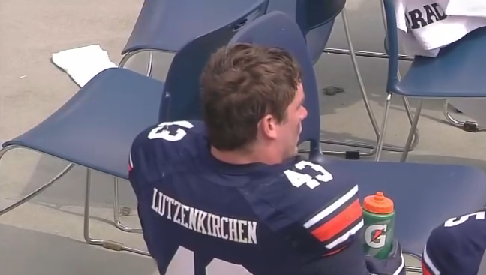
Ok, that title might be a little harsh (Lutzenkirchen can’t help that “Touchdown Maker” translates to such a long word in German), but the reason for what has no doubt been the biggest complaint that I’ve heard about Auburn’s minor uniform tweaks can be blamed for the amount of space Lutzie’s name takes up.
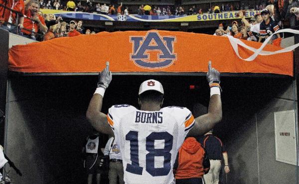
I warned you about the smaller names on the back of the jerseys a few weeks ago, but it seems that you just needed to see them in person or from multiple angles on TV to see just how much you hate them. I don’t disagree with you. It looks like a little kid’s jersey or something from a video game. It just doesn’t look right and is hard to read.
Like the fabric and overall style changes made by Under Armour that caused the now pointed pants stripe, it appears the same type of changes limit the amount of space for the last names.
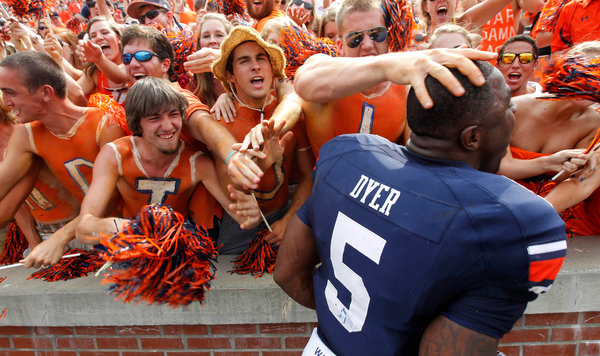
Take a look at the back Michael Dyer’s jersey up there. You’ll see the patch of fabric that contains his last name. You’ll also notice that the top corners of the fabric butt up against some different or extra piece of fabric between the back of the jersey and the shoulder/sleeve. This extra piece of fabric is apparently part of Under Armour’s new design that made their uniforms more stretchy and cut the weight by 20%.
Note: You may also notice that the new little piece of fabric has pretty much made the stripes on Auburn’s sleeves nothing more than a little patch.
Now take a look at Lutzenkirchen’s name on the name plate. It takes up the whole thing. The “L” and “N” are right next to the seam that connects the aforementioned extra piece of fabric, meaning that’s as far as names can go. So what probably happened was Under Armour took the longest name on the team, made it fit, and then was stuck with the smaller font for the rest of the names.
Just for reference, here’s how the names looked last year, and as far as I can remember, have always looked. Quite a difference.
Oh well, this has nothing to do with the fact that Auburn must win a football game this week, but I’ll stop doing these uniform blogles when they stop being the most viewed posts on the site.
11 comments
What about all the other Under Armour teams that had small names? Unless they have Lutzie’s too.
Also, check this out: http://d.yimg.com/i/ng/sp/ap_photo/20101126/all/l4872768.jpg
They could make it work.
I’m sure the other teams have someone with a name just as long.
Yeah, probably.
I think you’re onto something with that extra sliver of fabric. I’m sure that has something to do with the smaller nameplate.
they were different back in 2003: http://2.bp.blogspot.com/_0EXy6lqCztM/SobQs6SeGRI/AAAAAAAACW0/8dey8qB69hc/s1600-h/192280614_9b980a699d.jpg LOOK!
I like it…looks clean. Plus, its not about them as individuals, its about Auburn.
Oh well you have the number and the internet. If don’t know then you need get busy finding out about our great players!!!
Is it my imagination, or are the numerals much smaller as well?
Yes. According to Under Armour… “the numbers are an inch or two smaller.”
I really do not like the smaller font for player names, or the scaled back arm stripes.
If the names can’t be read, why have them all.
I haven’t quite decided yet, but I think I like the smaller names and shoulder numbers better. They take up less room and help make the jerseys look less cluttered.
Please bring back the full size jersey numbers.