Let me just go ahead and get this out of the way. These are not connected to Auburn in any way. This is not an attempt to get Auburn to wear these. These are just some concepts from a guy who does this sort thing for fun for almost every Division I team. Now that we have that out of the way…
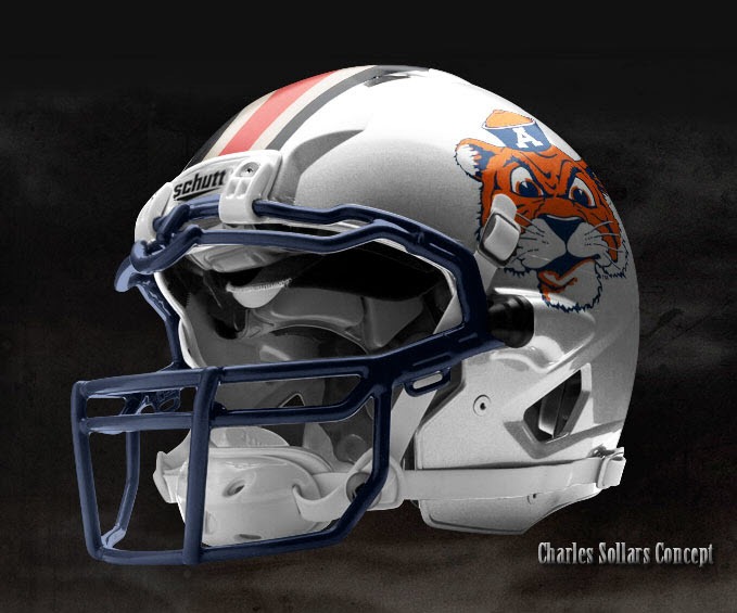
I was told about Charles Sollars‘s work a few weeks ago, and after seeing a few of his concepts from other schools’ helmets pop up on a few other sites, I figured you may want to see the fifteen different designs he has for Auburn’s helmets. Some would never, ever fly. Some might. What do you think? He has told me that if you have any ideas, he will mock them up for us, so leave those in the comments section.
42 comments
The folks at Oregon should hire this guy! Some pretty good helmets. The one on second row, far right looks like LSU colors. Yuck!
I like the the Orange with the AU and the white with the old school tiger
I don’t understand the color schemes in a lot of these. One of them looks like LSU colors…. But overall I enjoyed this! I hope we stick with the tried and true helmet though.
I’m not particularly a fan of any of these, but I am intrigued by the logo on the third helmet on the top row. I’ve never seen that particular sleepy/sneaky tiger. Does anybody else know anything about it?
i can not find it anywhere, and Charles says he deleted it when he was done. I love it. It’s like the ultimate “U Mad?” tiger.
Perfect for trolling bama message boards! I kid. I kid. Without a doubt, that’s not my scene.
Anyway, while I’m here I have a concept idea. How about we take the eagle A from the first helmet and put it front and center above the face mask (kind of like those Wisconsin throwbacks from a few years ago). Then we sweep the eagle’s wings back a la the Philadelphia Eagles. I think it would look pretty good on a white helmet (although not good enough to ever take the place of our classic helmet.
Also, I’m partial to the suggestions of both Jesse and Thomas.
That is the original Aubie cartoon.
I doubt Auburn would ever go with something that flashy, but I think most of those are really cool. It’s fun to at least imagine.
Neat stuff. It’s fun to imagine, even though most of them would never make the cut. I’ll always be partial to the A with the eagle flying through it.
These would be cool novelty items but I dread the day Auburn uses something like this. Keep it classy/old school. WDE
If Under Armour ever made a pro combat uniform for Auburn I hope they use one of these helmets. I probably would like the one on the second row in the middle for the helmet.
I like the two tiger striped helmets that do NOT have a logo. To me a helmet that distinctive, adding a logo would almost be redundant. Also like the big AU helmet but the color of the helmet would have to be orange instead of the LSU looking color. I only see a possibility for a helmet like this being used for a bowl game. Now we would need uniforms to match…
The so called lsu colored one is a rug that is being sold for your guys I didn’t touch the color just blew it up and wrapped it on a helmet
I’d like to see a few prototypes with orange face masks. Some I love, some I’m not fond of. Great job Charles! It gets the imagination going.
Great work Charles, they all look great. Well done.. War Eagle…
one i’d like to see is a white helmet with the old plain orange A like on Pat Dye’s old hats. and make the facemask orange
I’m very fond of the plain orange and blue striped one… Also the first four I would love to see out on the field.
What’s up with the LSU colors?
Love the classic Aubie one, and the blue on blue tiger stripes. Fun stuff.
Are those helmets silver?
How about this – same classic color setup on a white helmet…I mean white, white. Number on one side (just like this – http://www.sportsfanoutlet.com/media/catalog/product/cache/1/image/9df78eab33525d08d6e5fb8d27136e95/ALXXAU6165A.jpg) and on the other “War Eagle” in simple block letters.
These are creative, for sure, but they only make me appreciate even more how good looking our helmets are. Keep the tradition!
This cat is amazing. What would it take for AU to use one of these? A deal with him & Under Armor?
Please don’t let the team where any of those… Ever.
I concur.
i definitely like the white helmet with the A and an eagle comin through it. Very sharp
I love the Eagle/A logo!
i definitely like the white helmet with the A and an eagle comin through it. Very sharp #wareagle
I dig a lot of these, especially #7 & #8. I’m generally a traditionalist, but I don’t see the harm in wearing an alternate uniform every now and then… and yes, I dig Oregon’s multiple looks.
I would definitely be down for the orange with blue stripes as a pro combat thing. I don’t know about stoner Aubie, but the rest are pretty cool, too.
I did not think alternate helemets would ever look good but I absolutely love 60% of these…
What does everyone think if our Offense wore one style and the defense wore a different style during the A Day Game then Auctioned of the helmets and Jerseys to fans? It would boast attendance on A Day and TV viewer ship( more TV money for Auburn and more exposure for the Football team/school. It would be a great recruiting tool… it would make A-Day way more interesting. This would not effect the regular season where we stick to the traditional uniforms.. and we create new uniforms Evey year for A Day…. will someone give me a Amen?
These are awful. If Auburn had to choose one though, I’d go with the eagle flying through the “A”
Oh oh maybe even wear throwbacks for A Day also.. Lets be honest!!! A Day is for the fans
P.S. I hate all the little changes on the uniforms last year… Barf.. list of bad ideas 1)side patches on the side of the arms they call stripes. 2) the war eagle tramp stamps 3) pointed stripes on pants. 4) the small name plates on their backs. We won a national championship with the normal uniforms in 2010
Boosting the hit count today?
The orange and blue tiger stripes without a logo looks too much like the Bengals helmet.
I do really like the orange helmet with the oval logo and the one with the eagle/A on it.
No. Hell no. Not with two cases of beer and three tubes of glue. No.
If they took the field with any of those, I would still be watching the tunnel entrance wondering when the team was going to show up.
As a UGA fan I’m a traditionalist as well when it comes to helmets. I do like the eagle through the A one though if you had to use one. Maybe for like a throwback homecoming game or something. Trust me, you would want to play a lesser opponent when wearing one…. getting stomped by UF, Bama, or Boise is not fun, especially when wearing some type of gimmick.
The burnt Orange with the Tiger Eyes logo is AUsome!
Really good work in all of this. For the record, I am not a fan of any of the striped Cincinnati Bengals style helmets.
@WarBlogle
The tiger you are referring to, I sent him a few weeks ago. It was a sticker on an old mirror that was digitized. You want it again?
I had an idea on a uniform for the AU. It’s all about the Tiger strips….not to much thou. Down the strip on the Helment, Down the strip on the Pants and on the shoulder pads (kinda like Oregon did with the Duck wings) but better…..and leave the rest the same ole classic AU uniform.
when it comes to helmets, we should always use those that are made of tempered metal or engineering plastics.’
Newest piece of writing straight from our very own online site
http://www.beautyfashiondigest.com/white-party-dresses/
Could he do a white helmet with the traditional blue & orange center stripes with a logo that has the oval tiger eye logo nested onto the wingspan of the spread eagle but without the A? Basically, the logo would be a combination of the top-left one and the one in the 2nd column-2nd row.
As a designer and former Auburn local and student I abhor any attempts to modernize this classic school’s logo and helmet.
I will take out full page ads to stop something like this.
Keep it classy, keep it classic.
But what is truly classic? https://warblogle.com/2012/01/05/football/a-visual-history-of-the-auburn-football-uniform/
I don’t see anything wrong with using multiple helmet/uniform designs. The classic look is fine, but using new, modern designs is ok too. It doesn’t change who Auburn is, it just brings them into the modern era. Today’s recruits like the new, flashy designs and it couldn’t hurt in that area.
I like the tiger eye design on one side of helmet and the AU on the other side. Also, having the tiger stripes down the center of helmet would be cool. Use the chrome helmet look to bring the flash.
WAR EAGLE!!!!!!!!