Just as I did back in 2009, with the start of the Chizik Republik, I have given the Blogle a new look to go along with the new day of Auburn football. As you’ll notice, the home page has said “bye-bye” to the traditional scrolling blog layout.
With the 5th iteration of WarBlogle.com (codenamed Blogle 5.0) since starting in 2007, I went with more of a newsy-magazine look. No, that doesn’t mean or imply that I think this is a newsy website, but this layout gives you many more things to look at in one big space. Blogles are broken down by category and should keep things from getting lost once it leaves page one.
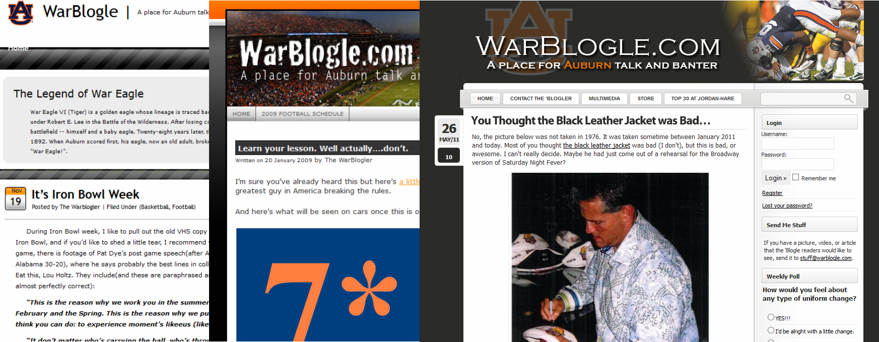
Just for fun, I threw WarBlogle.com into the Way Back Machine to remind us how far we’ve come since 2007. Ol’ Blogle’s come a long way.
I have a few other features that didn’t want to cooperate with the initial launch of Blogle 5.0, so those will roll out over the next few days… hopefully. In the meantime, click around, read stuff that you missed the first time around (the main reason for the layout change), and tell me what you think. If you see something that’s a little off, let me know, or just ignore it and don’t contribute. Whatever.
If you do feel like helping, keep in mind that thousands of blogles were written within a certain design that is no longer being used, so changing that design will obviously leave some things looking a little ugly or off. And now I’ve probably lost most of you who only really care that the site looks different. Either way, any and all feedback is welcomed. This is a work in process, and I’ll clean it all up as we go along.


12 comments
Don’t really like it
Definitely white.
It’s not bad.
It needs more Barn.
I like the old look better..
Lookin’ good. I like the newsey layout. The twitter feed is a nice addition, and I like how there are the different sections for different sports.
I like it. Very clean and very easy to get to articles. Nice job.
Ok, here is something I am not a huge fan of… Truncated RSS feed.
Ditto
Fixed.
I like it. I liked the others too. But I don’t come here for the looks, really. I come to read the articles, and have some good discussions on occasion, about our beloved Auburn Tigers!
Love the new look Blogle! It’s sharp